Crowning the king of the serviced apartment jungle
Back in July 2005, we met with Marcus Angell, managing director at Hot Digs — a serviced apartment agency, with six staff, advising and making bookings for local clients. Whilst explaining that they didn’t find rented rooms for metropolitan thesps was a bit of a chore, their Spanish account manager answering the phone with a breezy ‘Hot Deeex!’ was more troubling.
We made a promise that day to help fuel the growth of the company with a thorough rebrand. Hot Digs wanted to approach potential corporate clients, with absolute confidence in the firm’s new brand identity and service.
Six months later, we relaunched the company as SilverDoor. The new name, brand identity and website began to change the external perception of the business. We went on to assist with some fast growth in the years to follow, working on numerous advertising, direct marketing and web design projects.
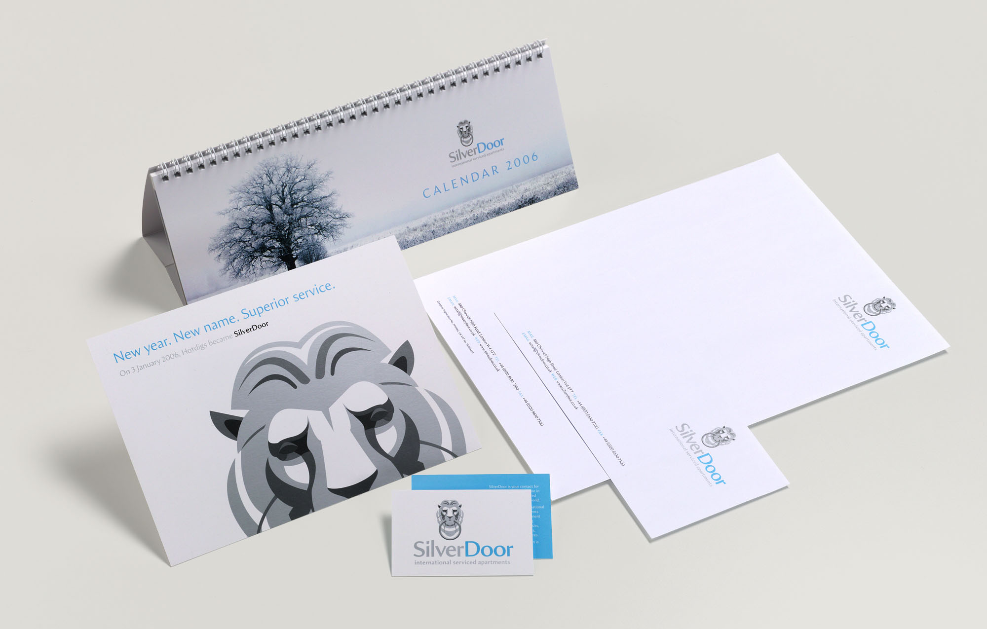
Original SilverDoor branding (2006)
In July 2010, the company’s tenth year of business, we devised a 10th birthday advertising campaign for use in the trade press, with photography by Phil Ashley. Using some of the younger staff as models, we turned them into 10-year-olds for a series of ads, direct marketing for the launch of a new website and a cheeky 10th birthday video.
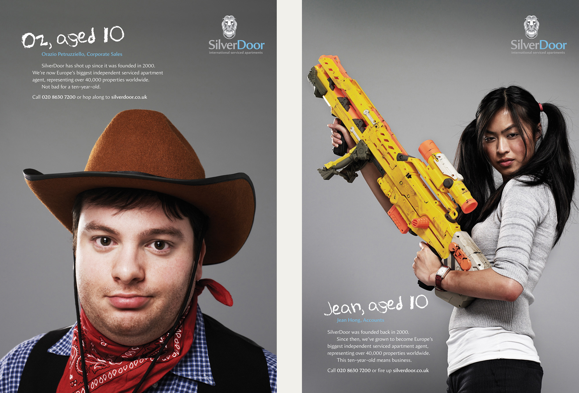
Two in a campaign of 10th birthday ads (with 100% real staff)
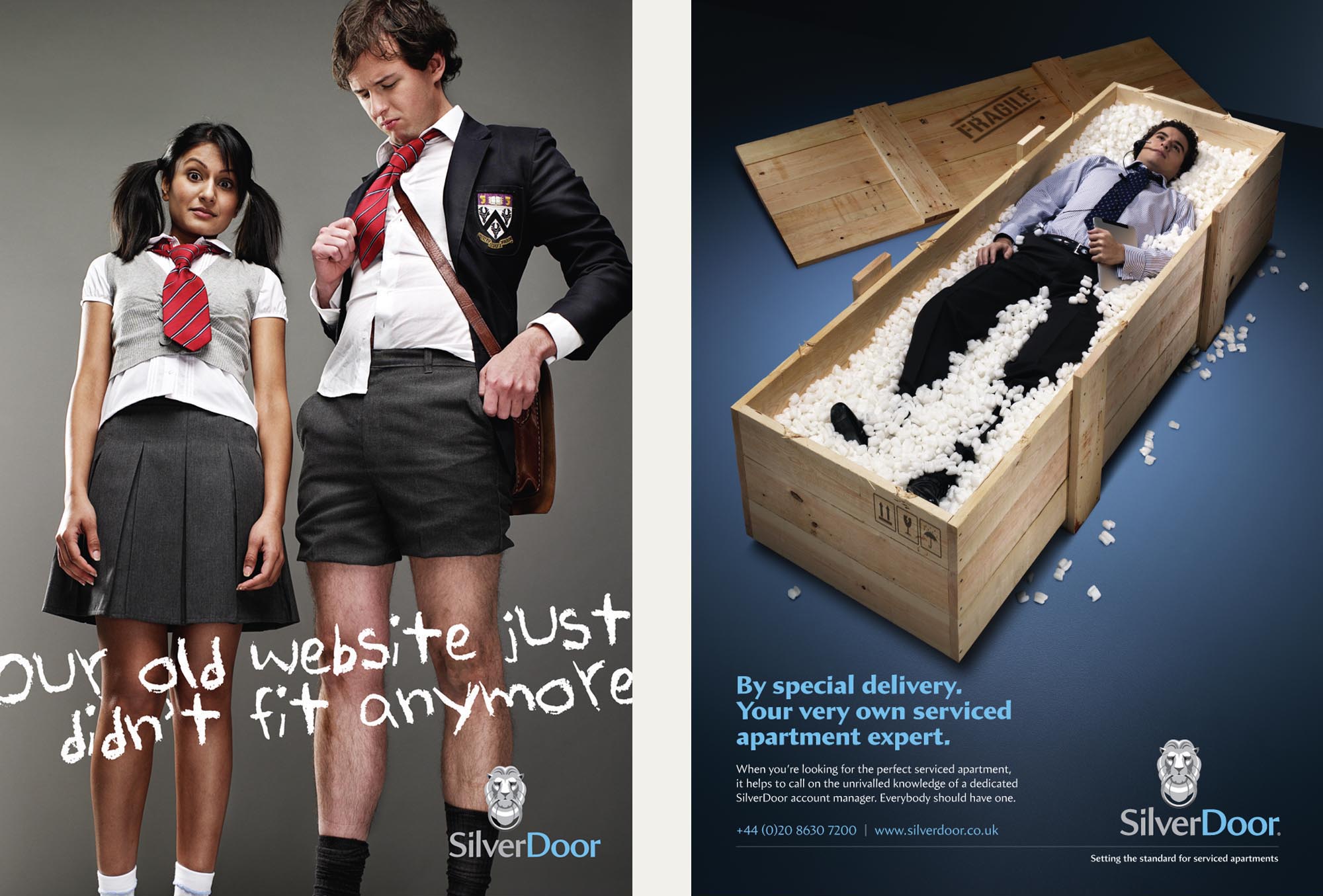
Launching a new website and new account managers
Nip forward to April 2014 (after some eight years of the original branding) and we were challenged with evolving the brand identity. The company was now international, it utilised proprietary in-house technology and numbered over 100 staff. SilverDoor had, in so many ways, ‘grown up’. It was now the world’s leading independent serviced apartment agent, dealing with a portfolio of blue-chip clients.
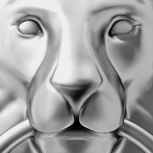
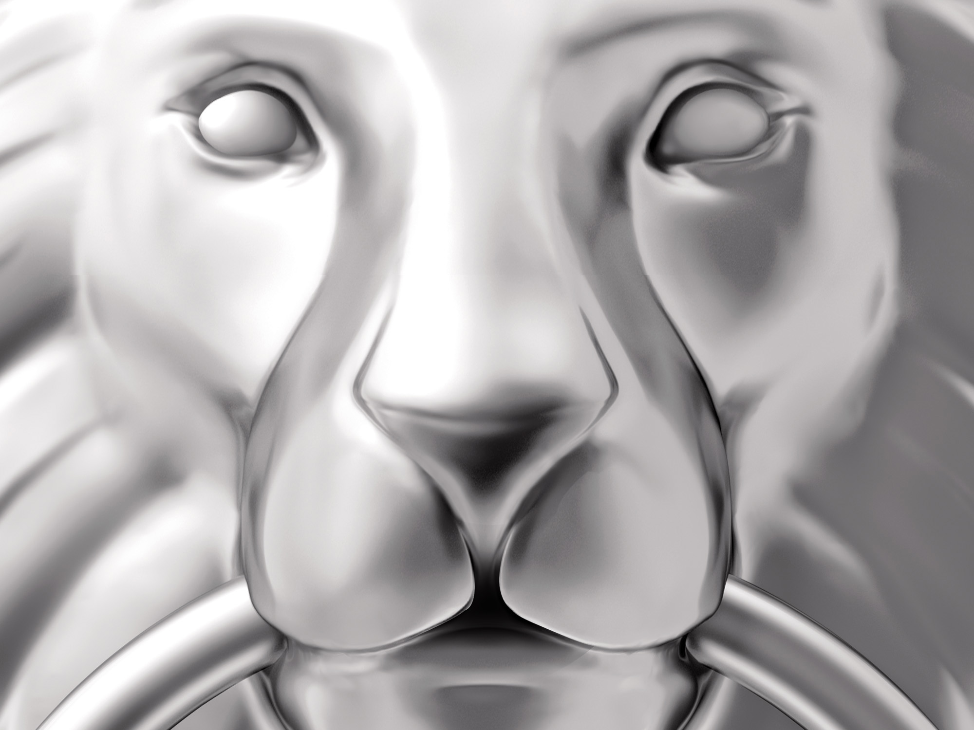
We took on a review of the entire brand identity that included the lion, typography, colours, stationery, signage, merchandise and web presence. The evolved, three-dimensional identity offered greater sophistication, flexibility and depth. A new set of brand guidelines was created to help SilverDoor’s marketing department with specification and implementation.
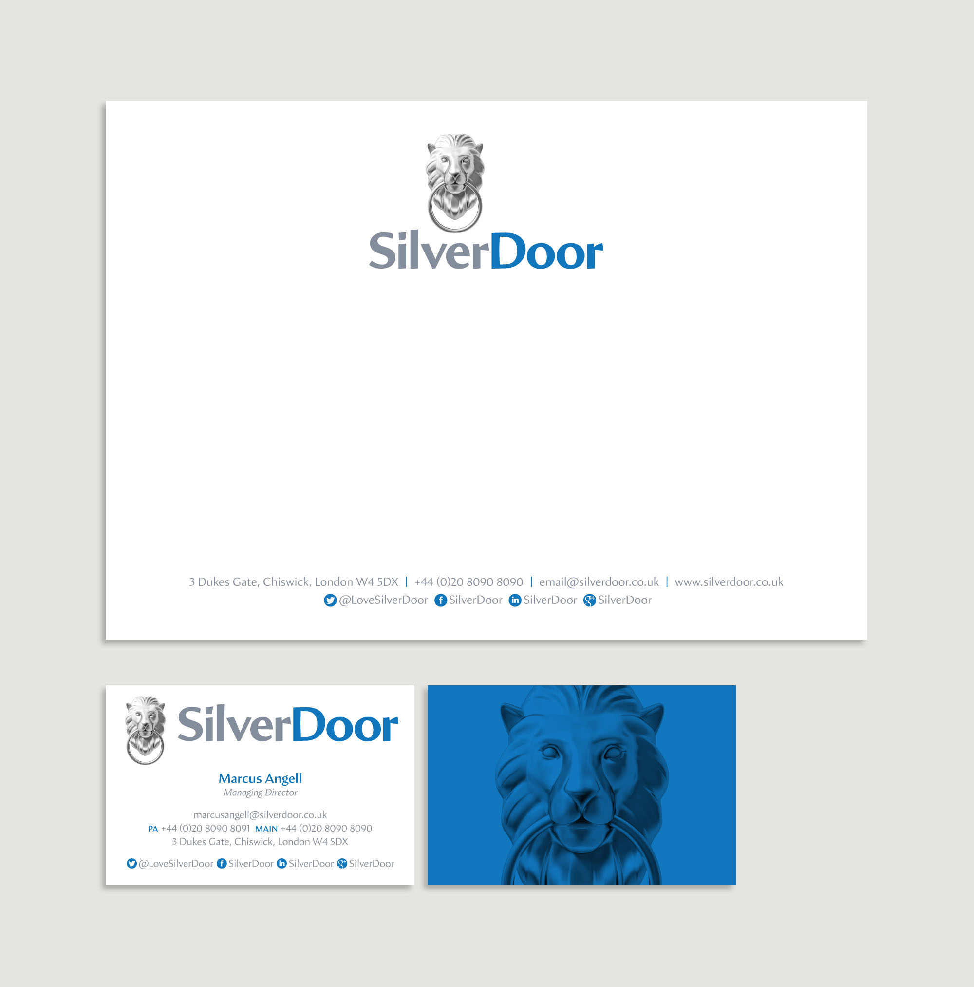
Evolved SilverDoor branding on stationery (2016)
SilverDoor’s branding and marketing stirred things up in their industry, with its irreverent attitude and distinctive approach. Our long term relationship with them has helped to genuinely transform the brand — enhancing reputation, profile and revenue.
Client
SilverDoor
Services
Brand identity
Graphic design
Advertising
Web design
Year
2005 >