Lights on. Nobody home.
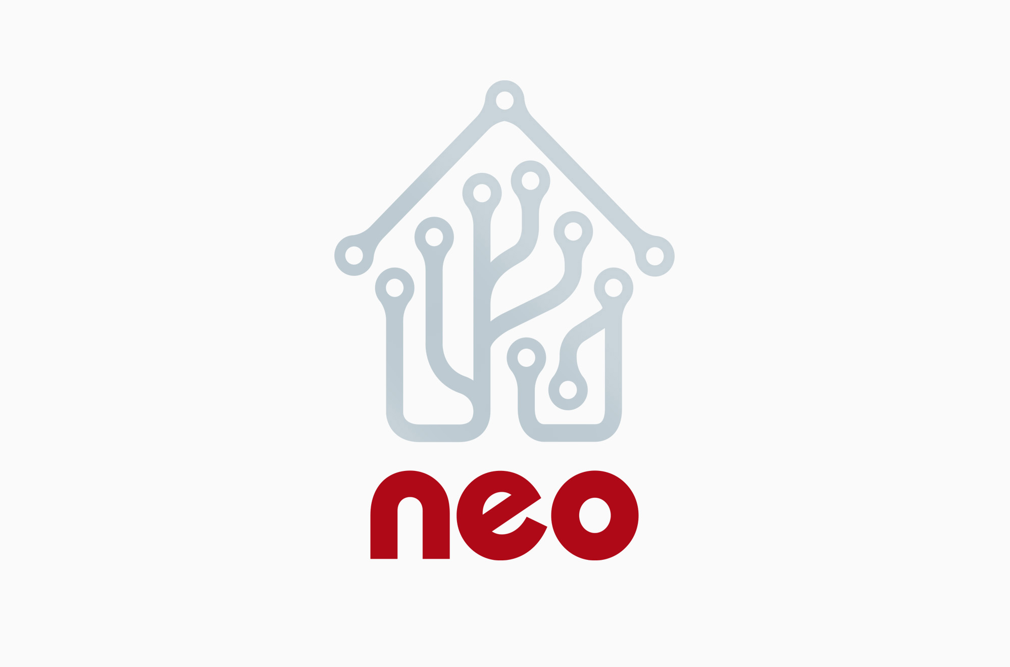
Neo, a London-based start-up, asked us to brand and design all their marketing communications.
Neo specify, fit and maintain the very latest digital technology for the home, with control managed by a digital tablet or remote access. This is the home automation (AKA domotics) that was promised in 1950s science fiction and now becoming reality. Your fridge knows how much cheddar you’re consuming.
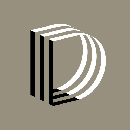
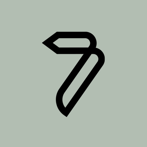
This little technology logo had to work at five millimetres high on device screens and three metres high on exhibition stands. Numerous sketches were made to determine the best level of complexity inside the design and the ratio of internal white space to stroke thickness.
If the design was too dense, it would ‘fill in’ and be indecipherable at very small sizes. If the strokes were too thin, the logo would appear weak at very large sizes. The logo also had to survive screen printing and debossing on products — processes that can badly degrade a mark if it doesn’t have sufficient visual weight.
Client
Neo
Services
Brand identity
Graphic design
Year
2005