Vial ‘M’ for Matrix
Matrix Science produce one of the leading software packages in the life sciences field. Their product range, Mascot, is firmly established as the standard for protein identification using mass spectrometry data.
Collaborating closely with the company founders, we developed a new visual identity for the brand. If you’ve ever looked closely at mass spectrometry data output (never?) you’ll notice that it’s a range of peaks and troughs. These peaks and troughs mark the presence, or absence, of proteins. Taking these irregular shapes as inspiration, we designed a new logotype for the company that was a visual echo of the data and suggested ‘M’ for you-know-who.
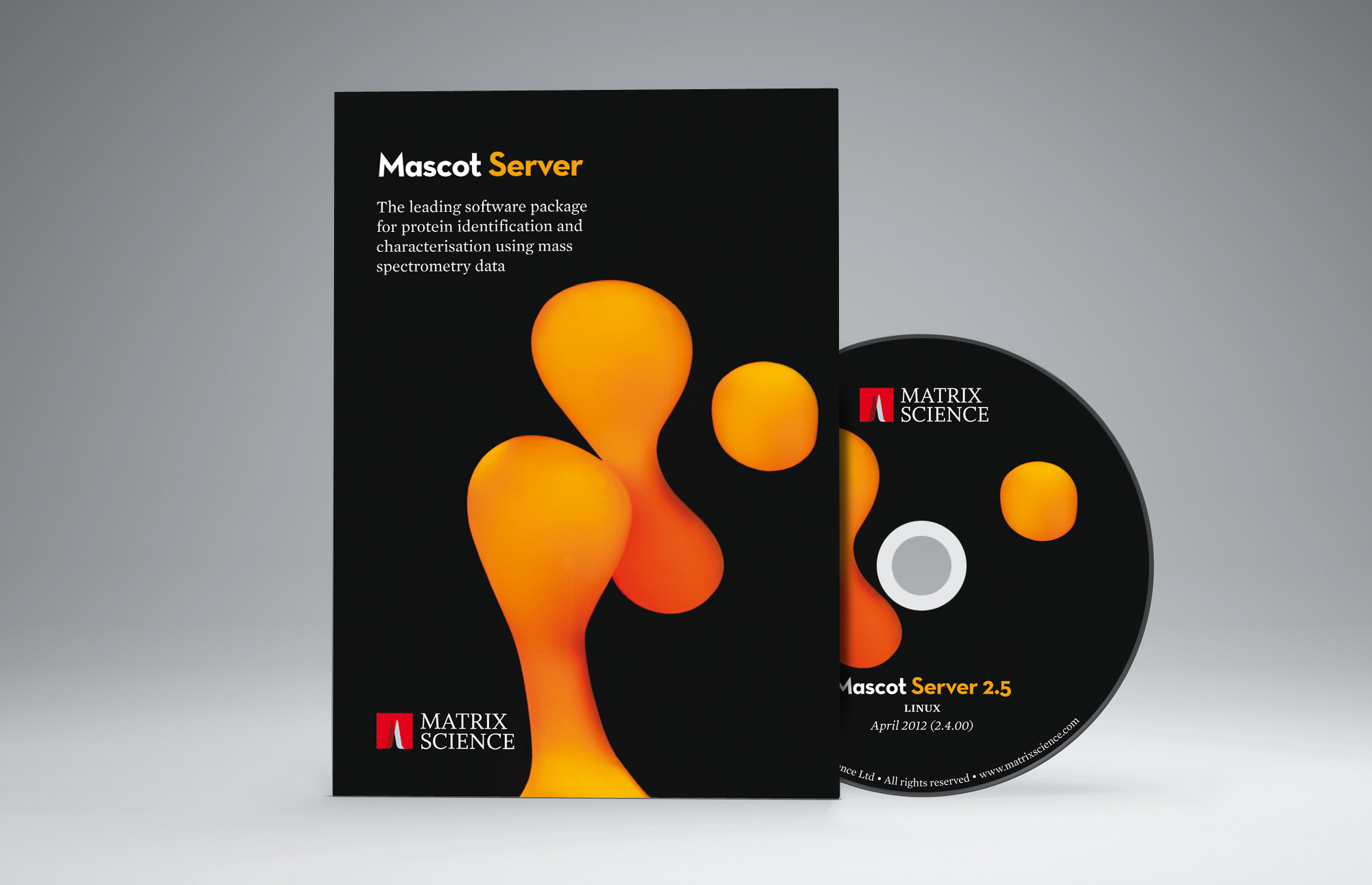
The packaging for the five Mascot software products required a more abstract treatment because of the very specialised nature of each product. Visualising each one in a literal way would have been almost impossible (and very dull). We decided to take hundreds of photographs of shape-shifting chemicals and use the most colourful and abstract ones as part of the new identity. One is shown above for packaging the flagship product, Mascot Server.
Matrix Science logotype
Client
Matrix Science
Services
Brand identity
Packaging design
Year
2012