Branding a PR agency for an industry that’s always changing
Johnson King, one of Europe’s most successful PR agencies for technology brands, asked us to pitch for their new brand identity and tri-lingual website in 2008. We have a track record of helping brands in the tech industry tell the world what they’re about and what they stand for.
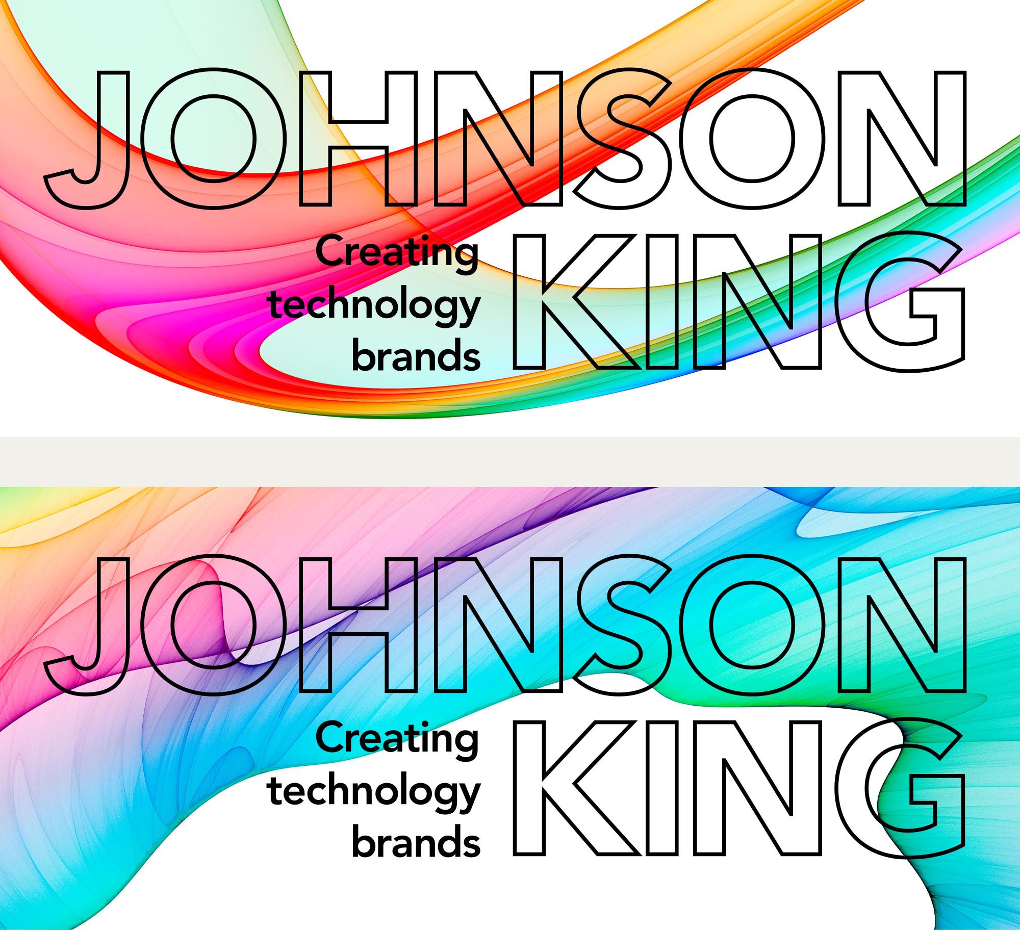
Developing the idea that Johnson King helps to shape a client’s brand reputation, and the fact that technology is constantly in flux, we built a morphing visual identity that kept changing but was always recognisably Johnson King. No other tech PR agency looked or communicated like them.
The brand identity was extended across stationery, advertising, interiors, signage and a tri-lingual website that we designed to serve their offices in London, Paris and Munich.
The agency was merged with Finn Partners several years later.
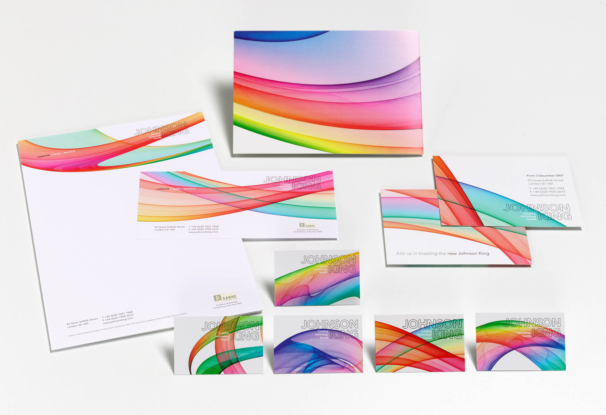
JK stationery. All the same but different.
Client
Johnson King
Services
Brand identity
Graphic design
Web design
Advertising
Year
2008